TRÜF
1253 18th Street, Unit 5
Santa Monica, CA 90404
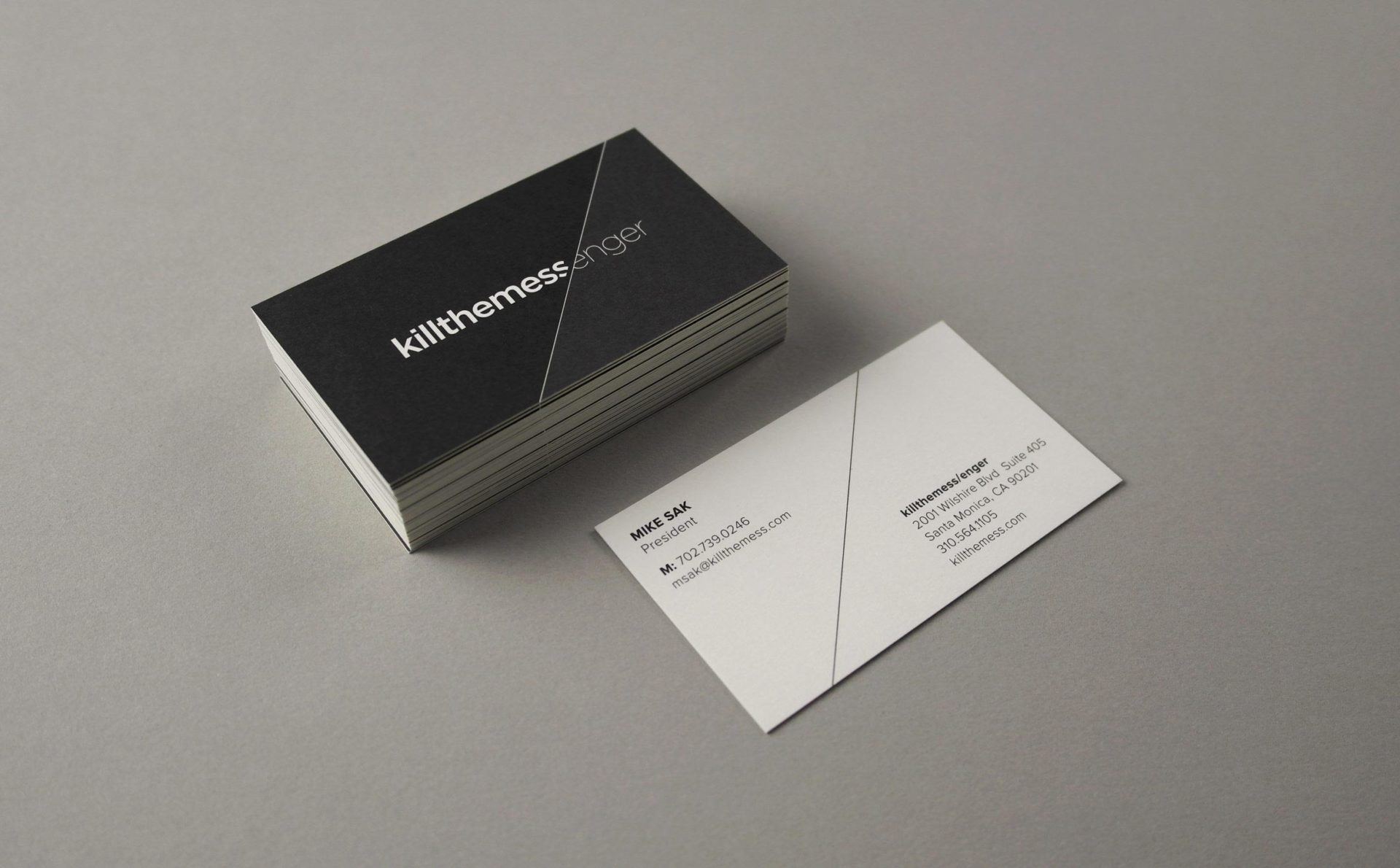
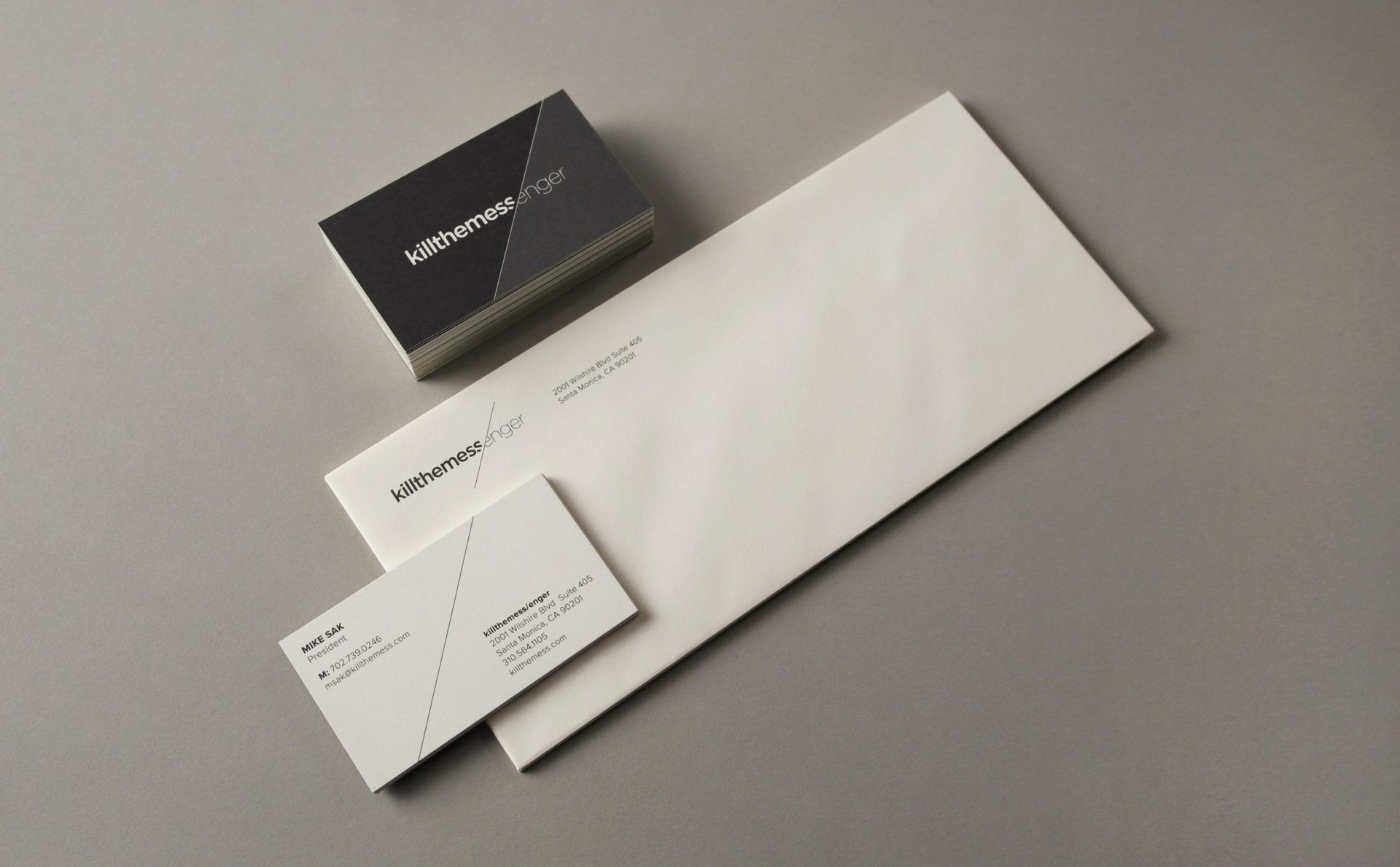
In an industry composed of dark rooms and stodgy corporate layers, killthemess/enger not only kills off the preconceived notions of what audio post-production should be, but shatters the industry paradigm. The simple logotype bisected with a diagonal is symbolic of how they “cut out” the unnecessary layers and break from their past.
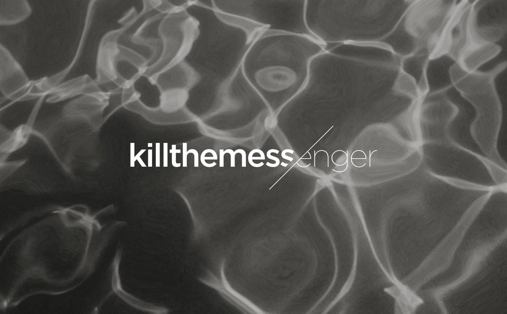

The diagonal motif is used throughout the identity to draw juxtapositions, delineate space and continue the theme of “cutting out” unnecessary, corporate layers.
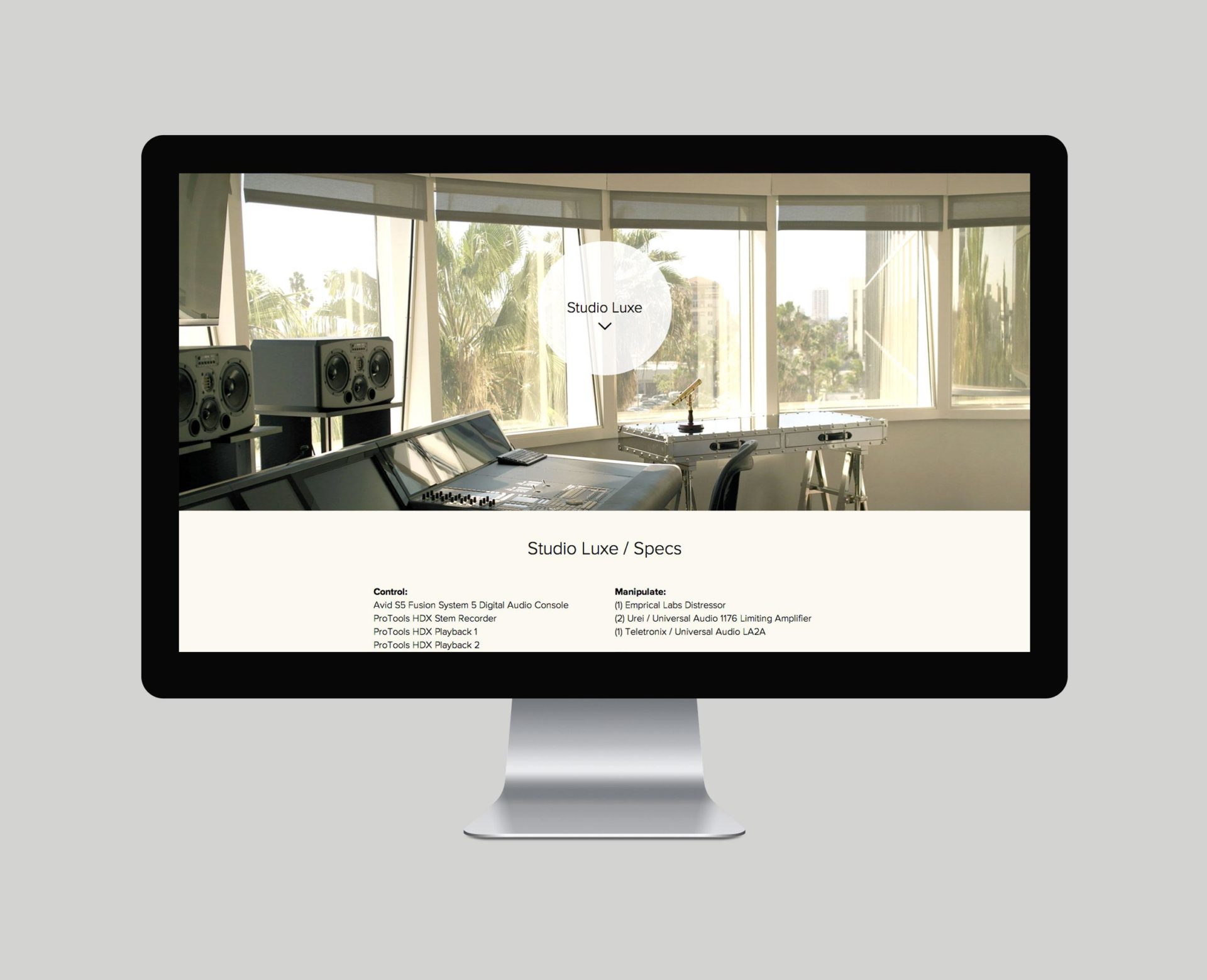
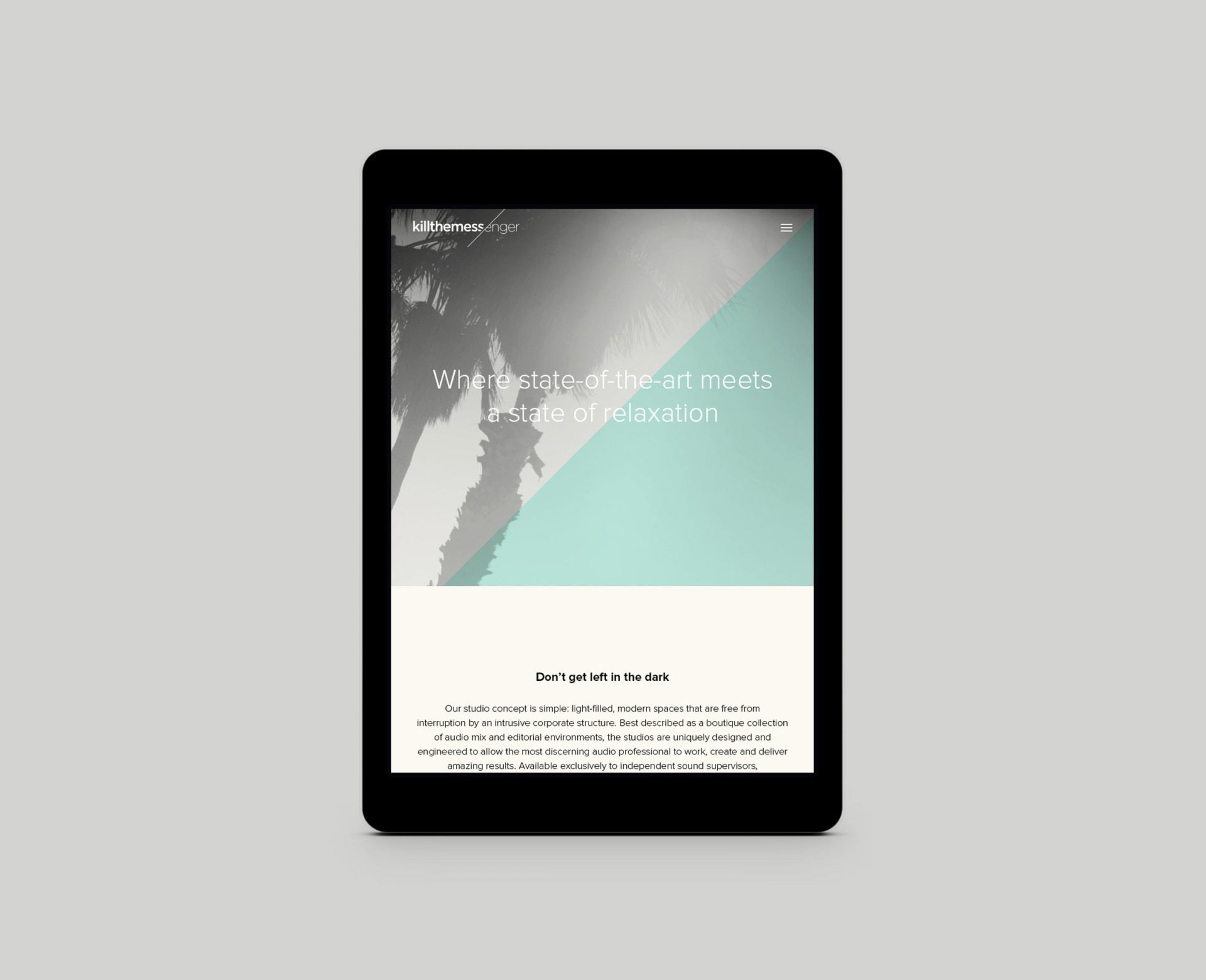
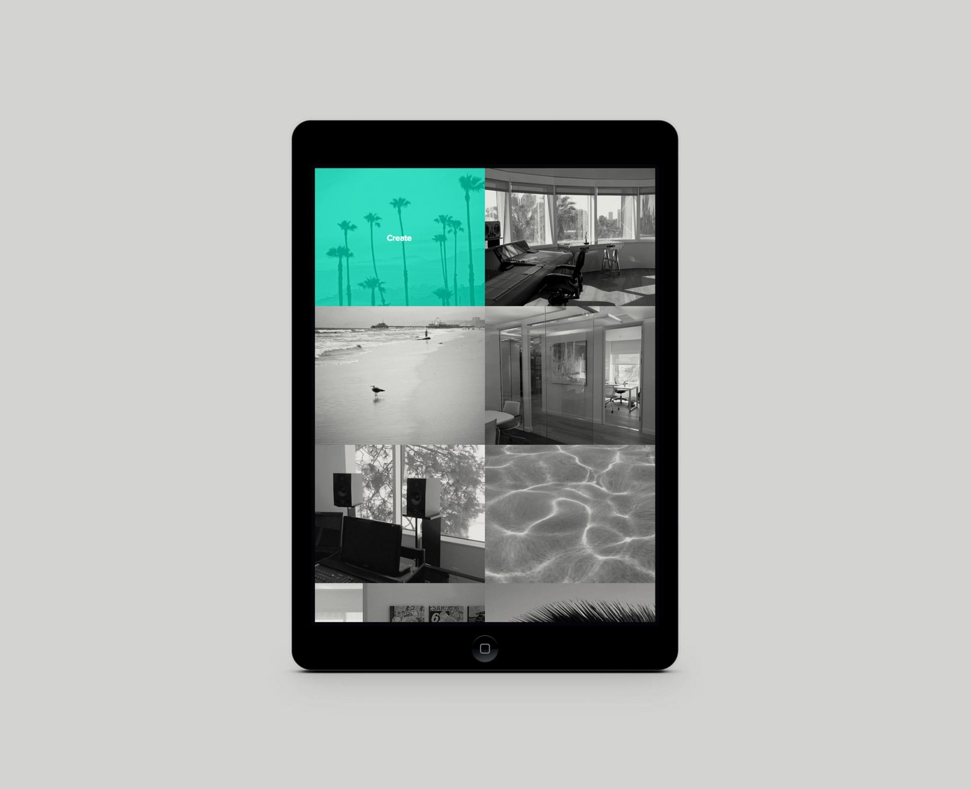
A responsive website using laid-back, SoCal imagery, video and pops of aqua help bring the outside in. A modern UX design includes specs for each studio.