TRÜF
1253 18th Street, Unit 5
Santa Monica, CA 90404

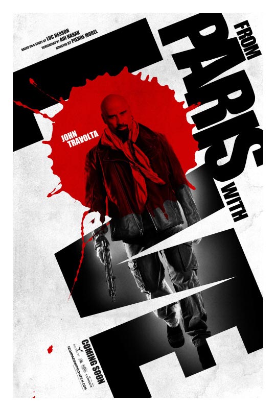
Every year I get excited for all the so-called “Oscar Movies” to come out. This year promises some great ones. But what really struck me this year, are how beautifully designed and unique the posters for these films are.
Having worked at Showtime Networks creating movie posters and key art, I know how challenging it is to go against the grain. Mostly because the higher-ups want “floating heads” of their stars to help sell it to the public. I think HBO changed that years ago, and certainly we’ve seen great design coming from the movie studios lately, but this year seems to have quite an interesting batch.
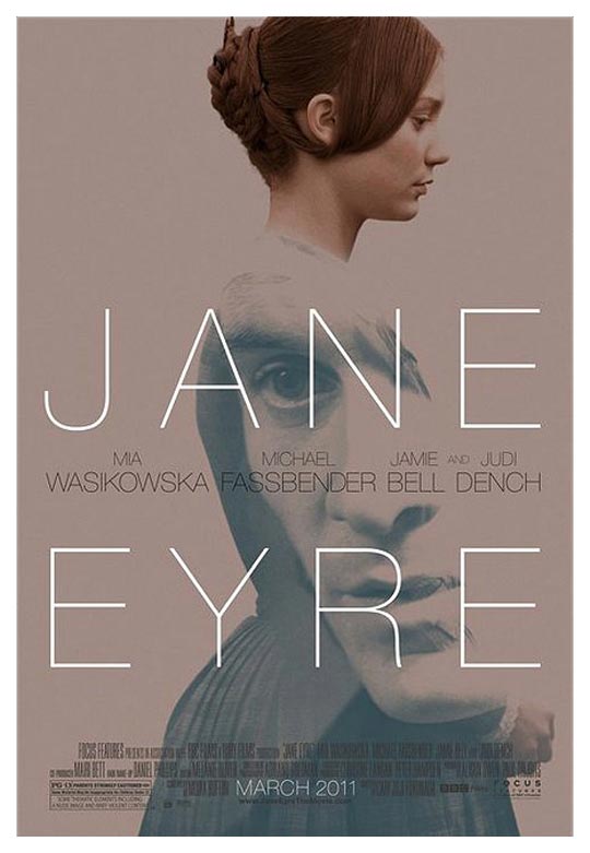
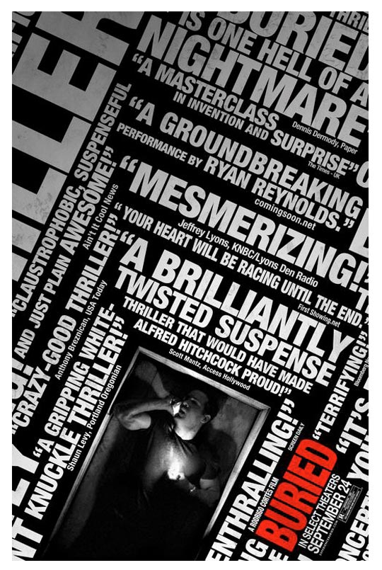
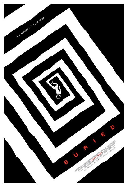
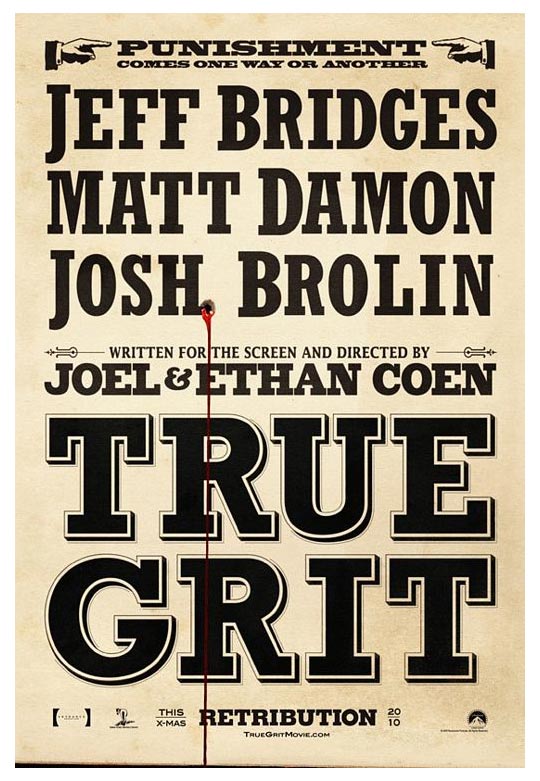
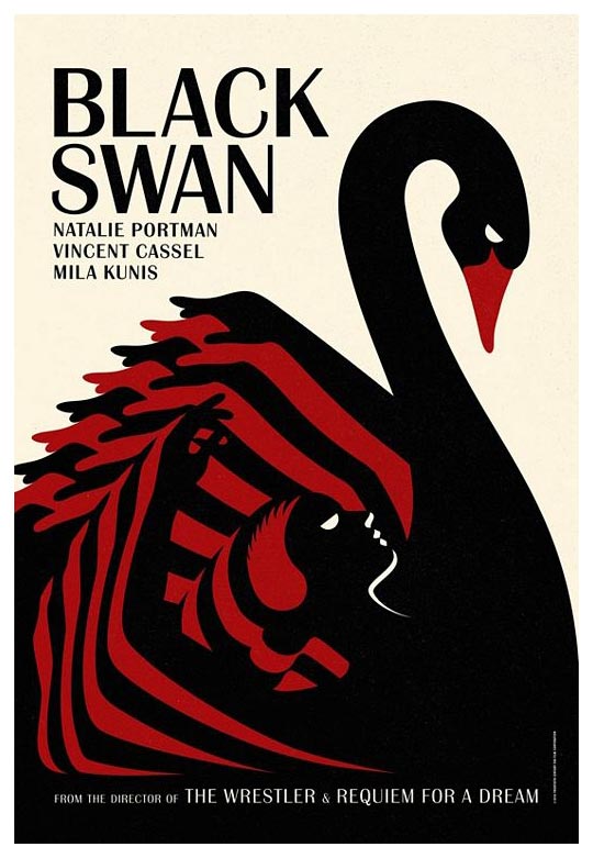
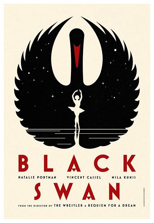
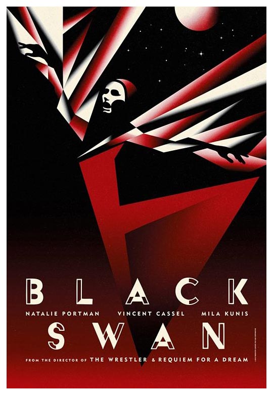
I love all the use of typography: elegantly wrapping around images, handwritten type around a soft profile, stacked type, slanted type, retro type. The graphic motif in “Buried” reminds me of the famous 1960s poster for Hitchock’s “Vertigo”. The series for “Black Swan” uses a 1930s Germanic Deco look to portray the dark edge of the film’s story. The remake of “True Grit” by the Cohen Brothers uses the old, western style motif. And I love how soft and pink the “Joan Rivers: A Piece of Work” poster is, as she is anything but.
I was already excited to see these films. These beautifully designed posters makes me want to go even more.
design credits: La Boca / The Refinery / Kellerhouse / Ignition / BLT