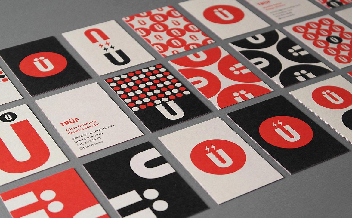
TRÜF
1253 18th Street, Unit 5
Santa Monica, CA 90404
As they say, “You don’t get a second chance to make a first impression.” Many clients ask us if business cards are still important in today’s digital age and we always say yes. It’s one of the few physical pieces that anybody holds on to anymore. You still give them out at parties, holidays, events, the gym. It gives people all your contact information and you can even put your twitter on there for a modern touch. Most importantly, it’s a great way to showcase and promote your brand.
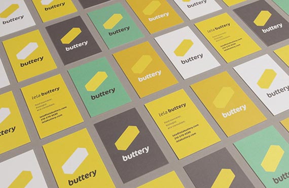
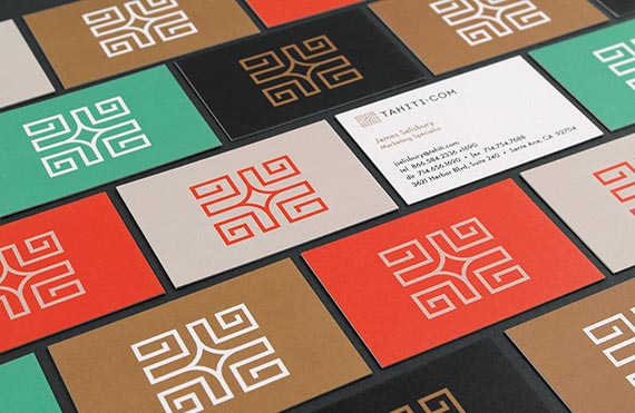
There are many different ways to design and print business cards to make your brand stand out. The visual identity should look cohesive with your website and all of your marketing materials. At TRÜF we believe in visual identity systems that include the use of a consistent logo, color palette, typography style, iconography and layout design. The printing technique and paper stock can also help create different feelings depending on the personality of your company–whether it’s upscale, fun or sophisticated.
Here are examples from our portfolio along with design & printing techniques:
Digital printing is the most cost-effective, but that doesn’t mean it needs to look or feel cheap. For digital we’ve been using MOO. The great thing about their Luxe Business Card line is it’s 4 sheets of Mohawk Superfine® stock glued together with a colored “vein” in the center. They are thick and feel good to hand out. With their printfinity technology, you can also showcase an entire visual identity system by printing various designs and colors on the fronts of the cards. These have the added benefit of becoming a conversation starter when handing them out, which creates an opportunity to talk about your brand.
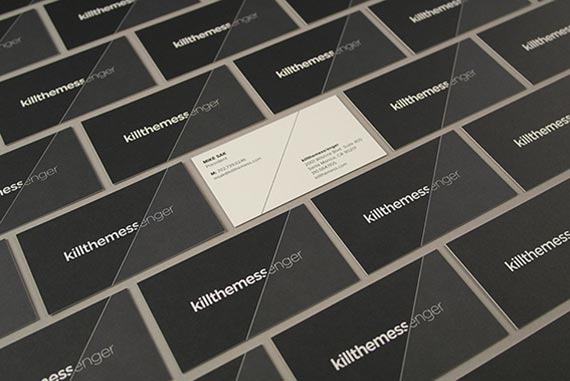
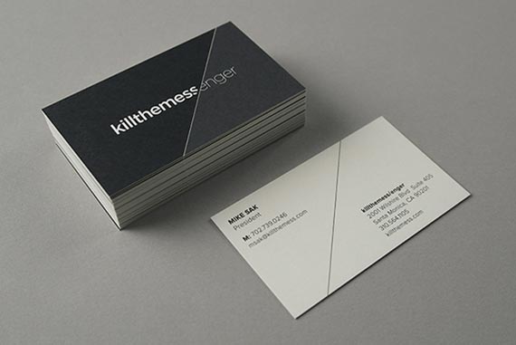
For killthemess/enger we wanted to highlight the diagonal motif in the logo and bleed it off the edges. There’s a two-tone black which highlights the “foreground background” effect defining KTM’s “break” from their past and from corporate culture. Printed on 165 # Classic Crest Super Smooth Natural White, we printed this traditionally with heavy, rich black ink that adds to the overall sophisticated feeling.
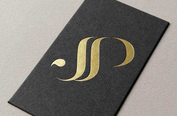
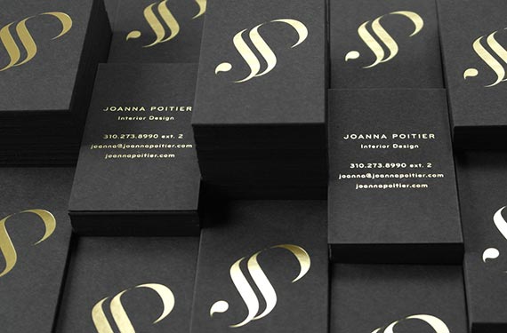
Joanna Poitier Interiors wanted cards that were very upscale and expensive-looking to appeal to their clientele. We worked with Mama’s Sauce and printed the monogram logo in gold foil on duplexed French Muscletone black cover stock (2 sheets of 110# cover glued together = 220# cover.) The result is a shiny, tactile card which is extra thick and feels as high-end as the projects Joanna works on.
So, when creating your business cards remember to put as much love and attention into their design as you would your website or ad campaign. They do still matter and people will take notice. And every time they see your card in their wallet they will continue to be impressed.