TRÜF
1253 18th Street, Unit 5
Santa Monica, CA 90404
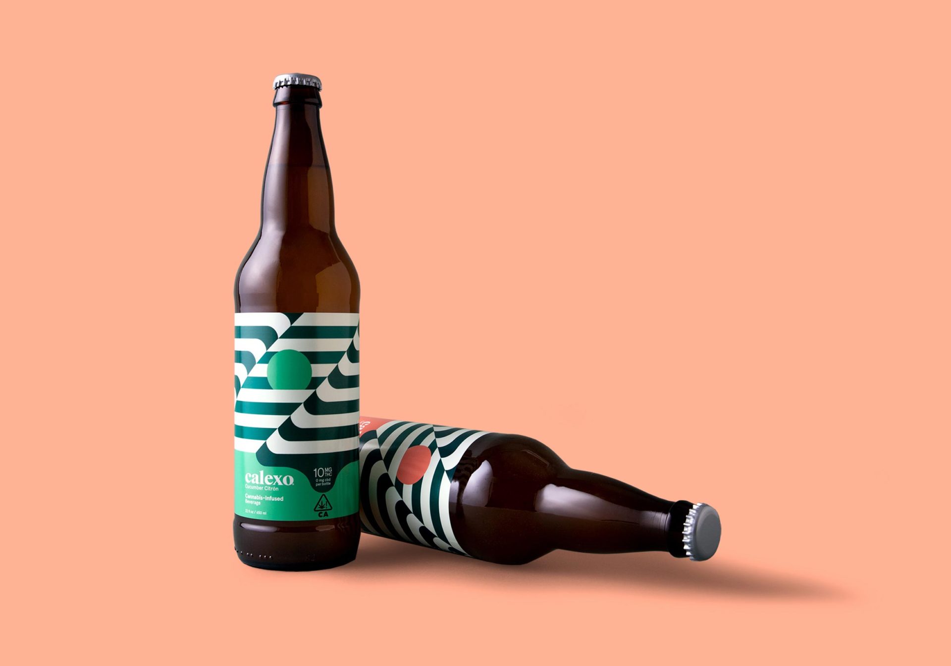
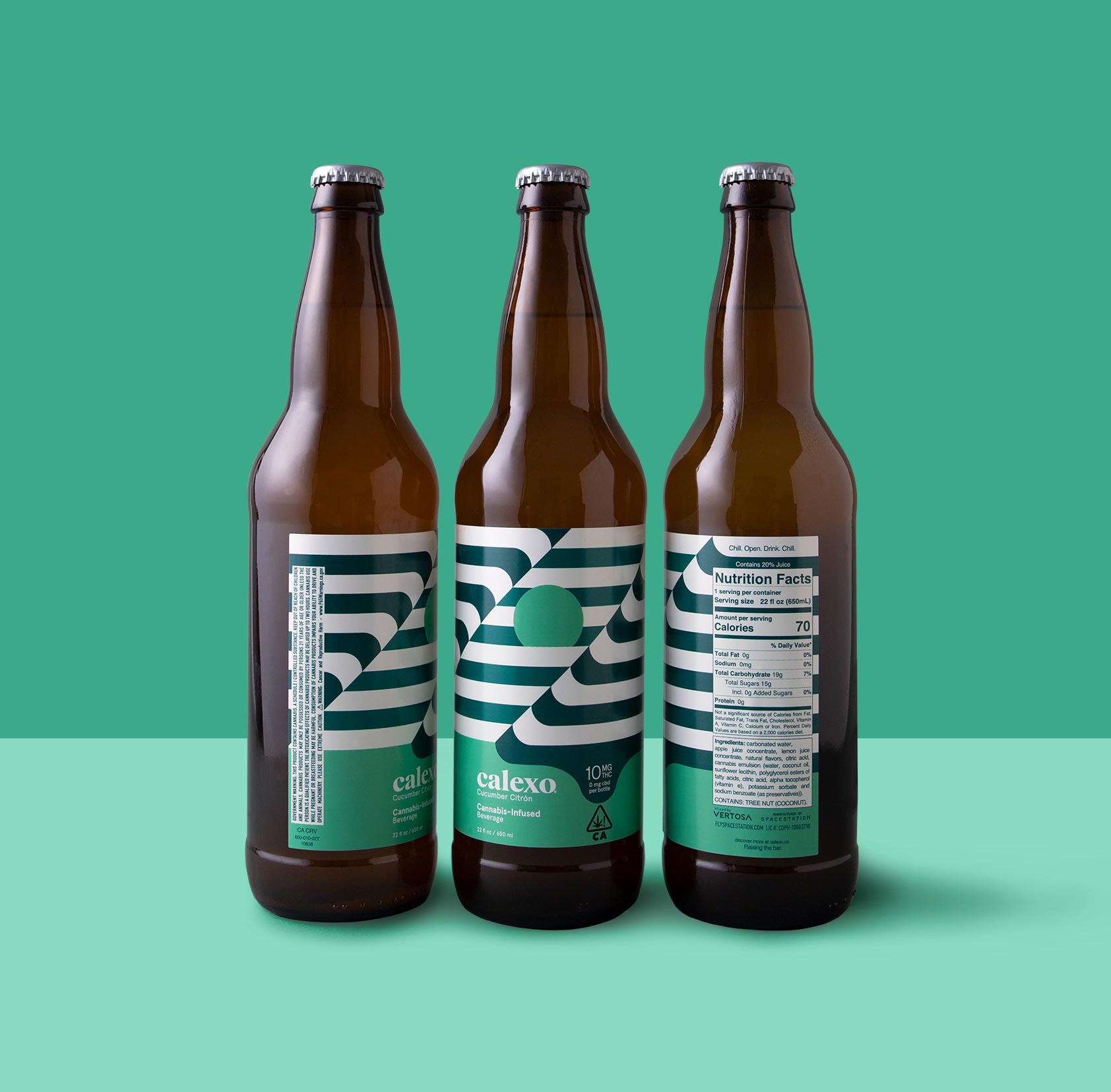
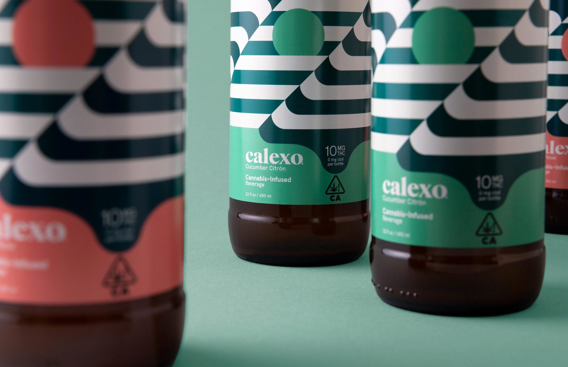
Calexo isn’t just another cannabis beverage, it’s a state of mind. It aims to shift perceptions and preconceived notions through art, flavor and science. Op Art “optical art” is the perfect graphic vehicle to portray this shift in a simple, artful way while avoiding dated cannabis clichés – allowing the consumer to perceive the illusion on their own terms.
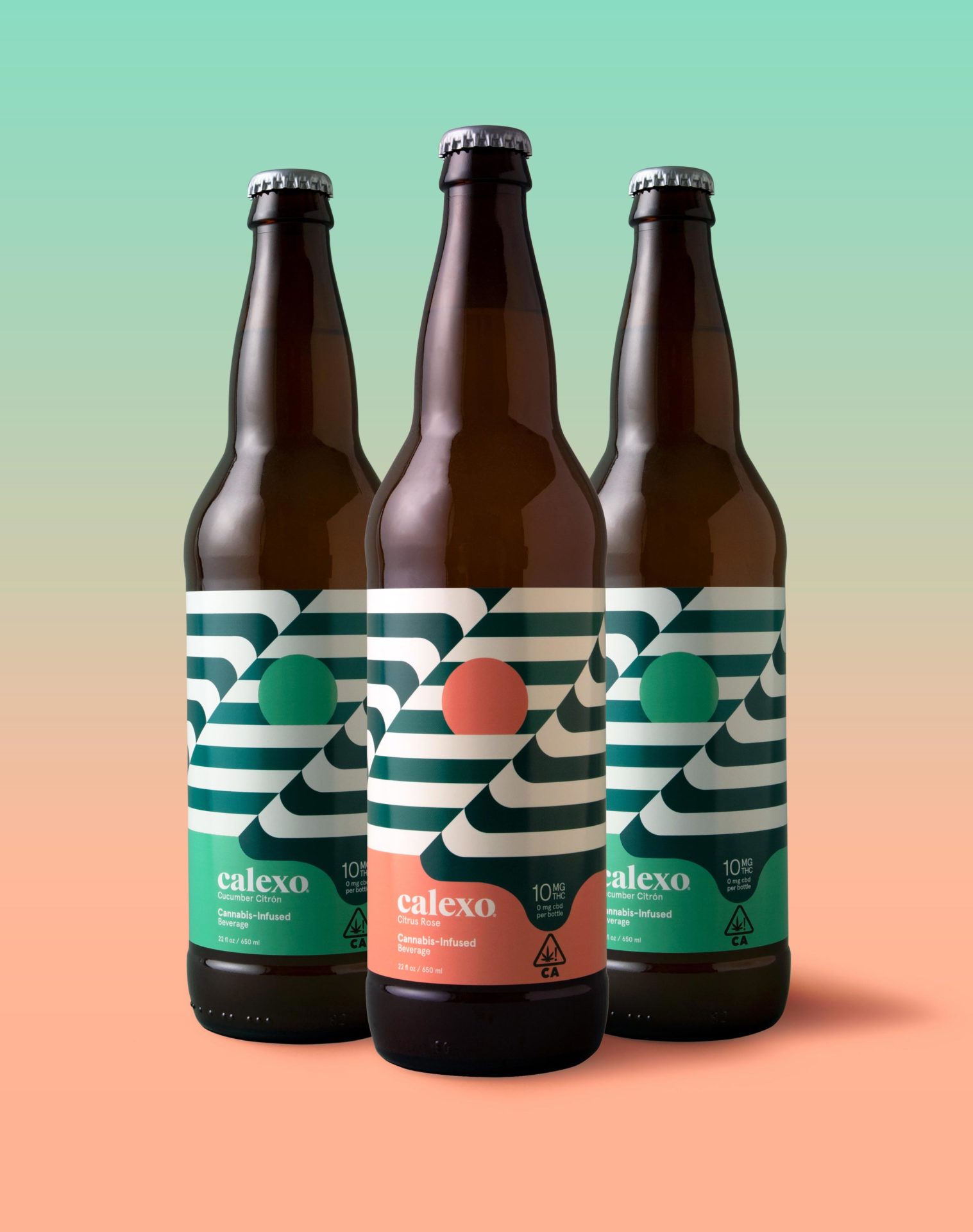
Capturing the laid-back feeling of the rolling hills, lapping water, brilliant sunsets and desert flora that defines the California and northern Mexico region, we applied a crisp, warm, color palette to both the brand and its unique flavor profiles.
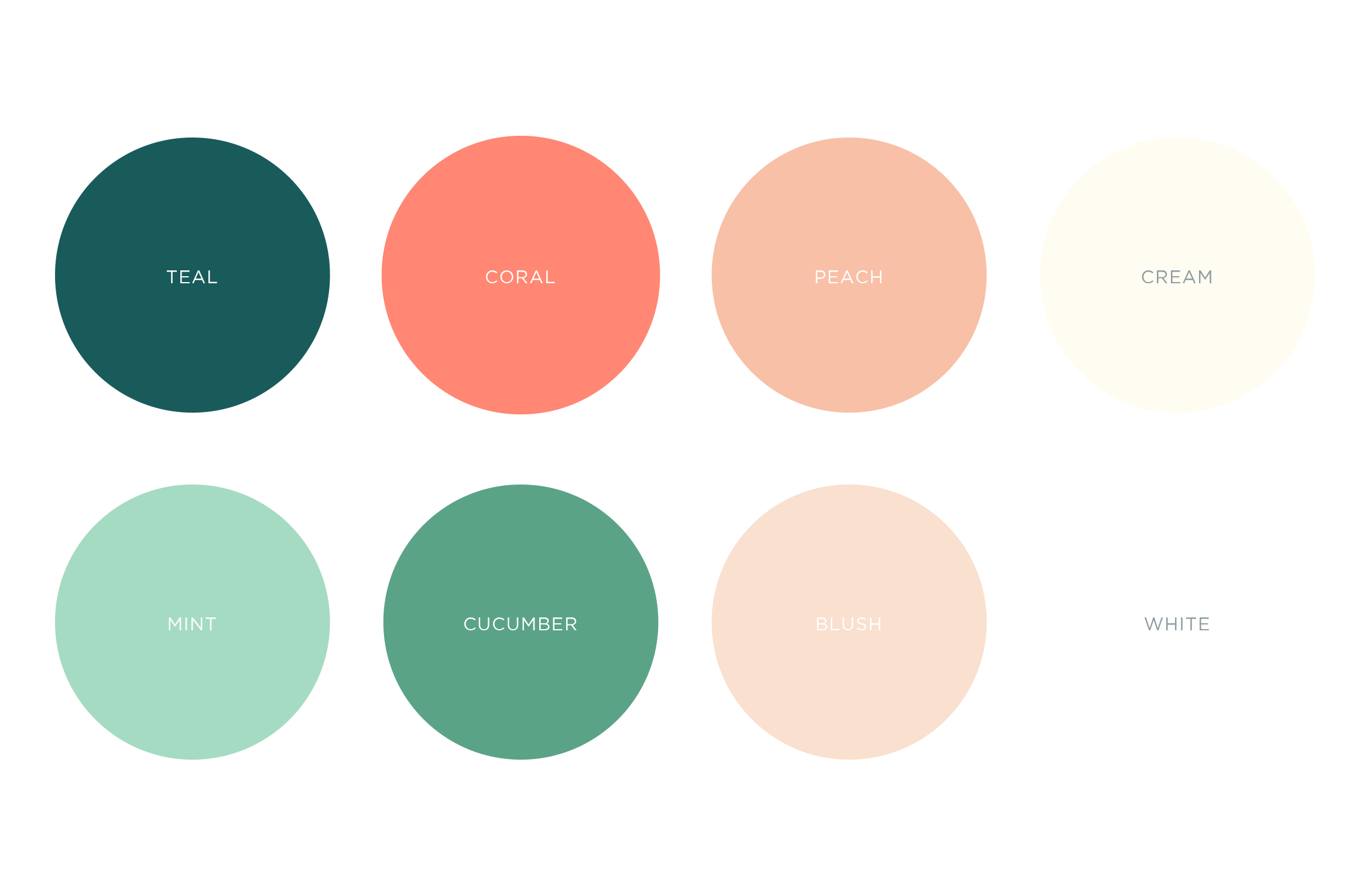

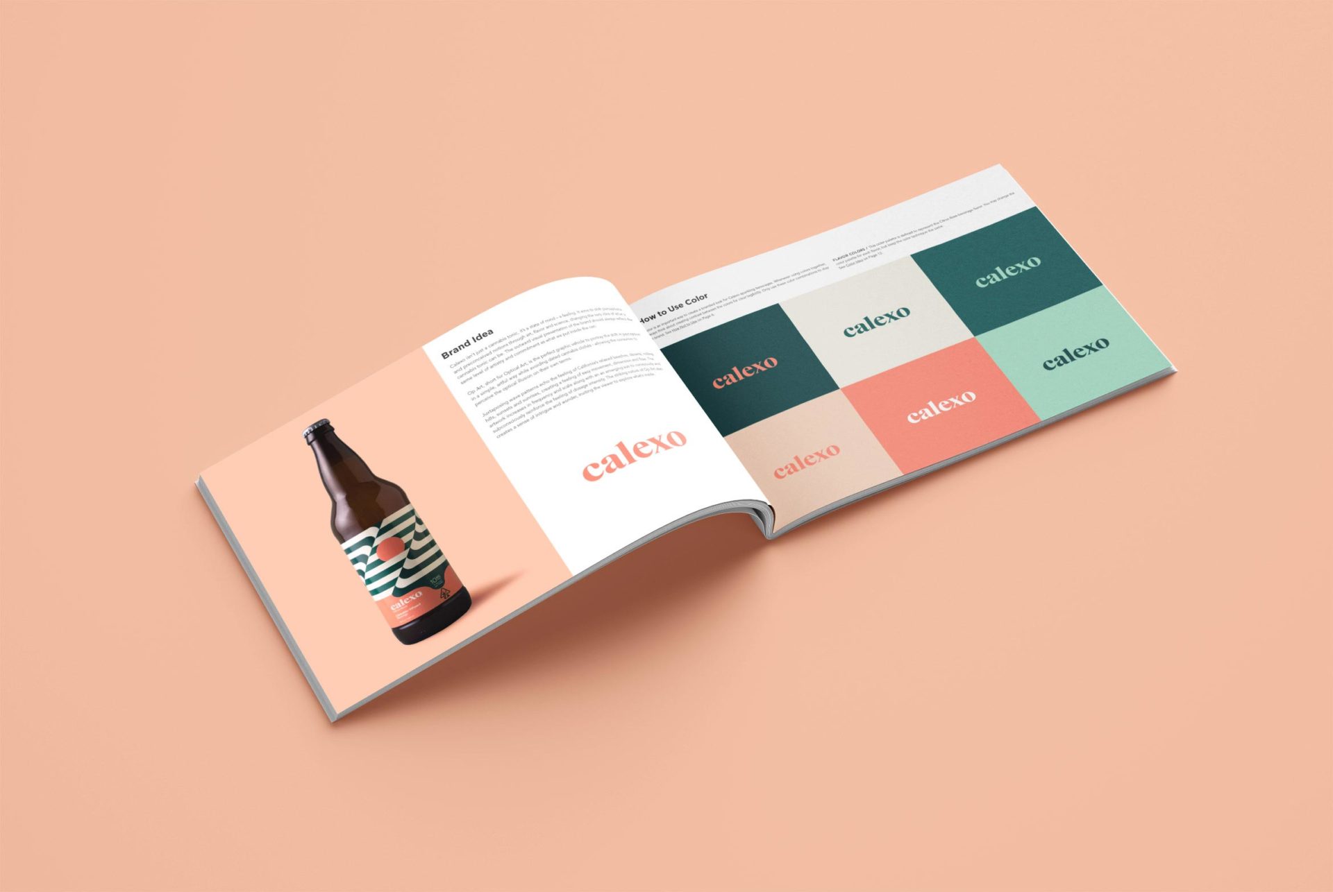
A Brand Styleguide keeps the visual identity cohesive by outlining rules for the logo, typography, color palette and graphic motifs.
Learn more about Calexo