TRÜF
1253 18th Street, Unit 5
Santa Monica, CA 90404
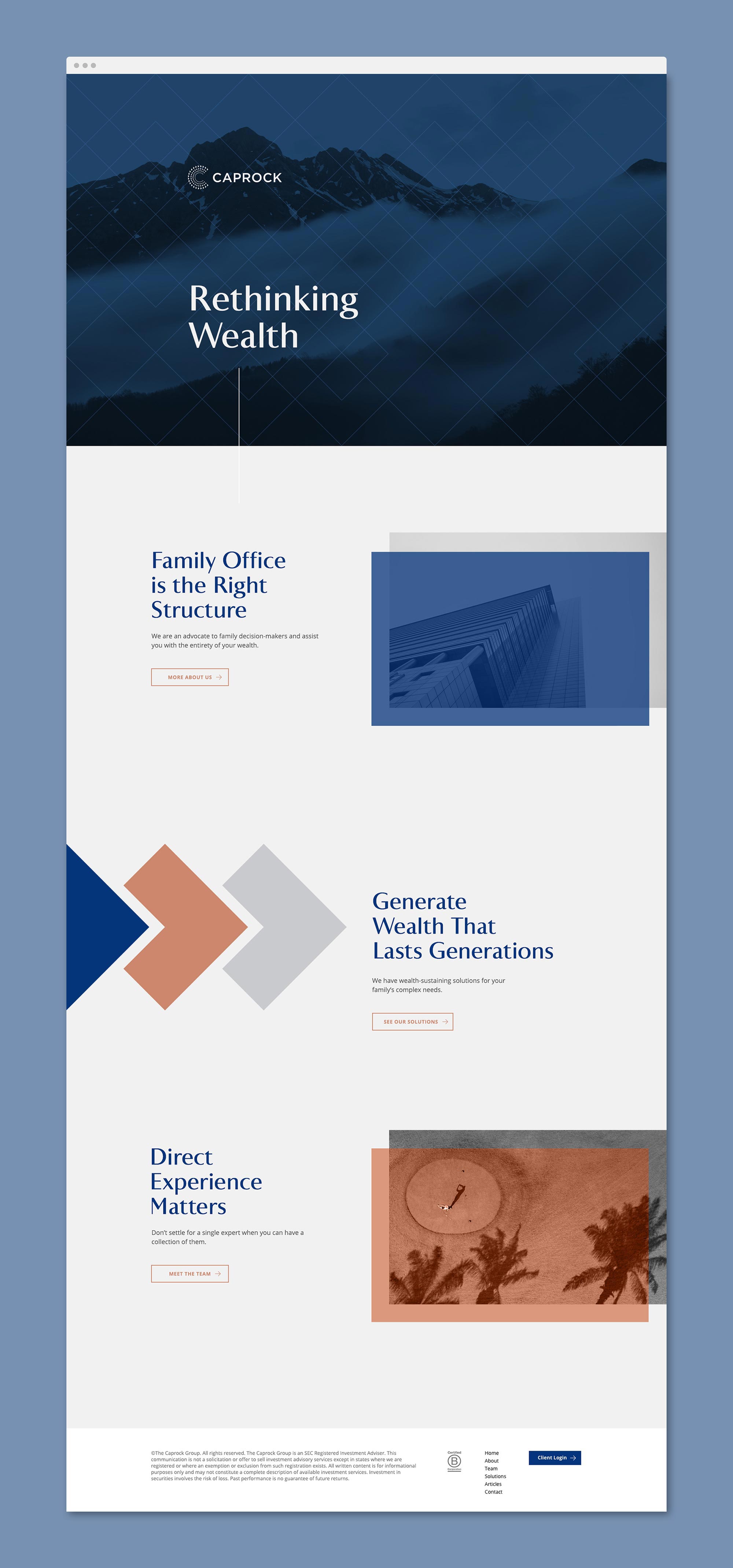
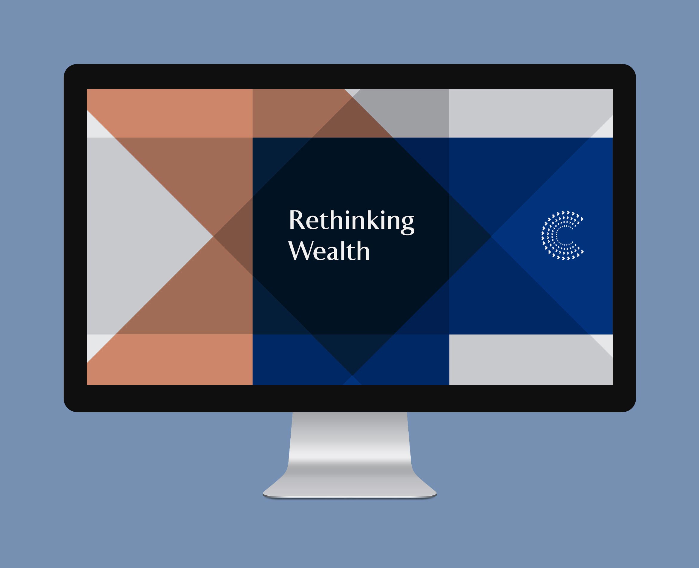
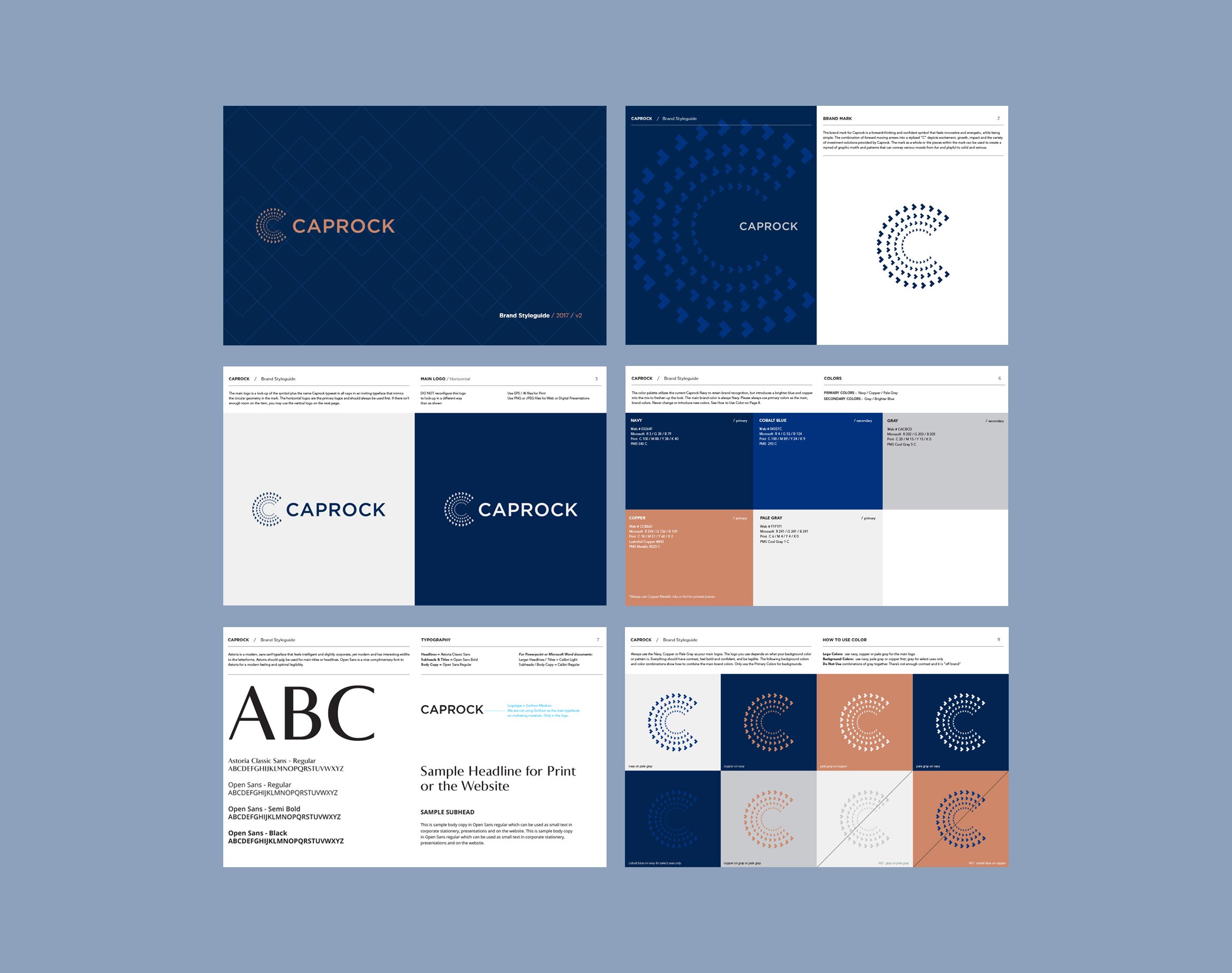
Caprock is a leader in managing family wealth with their personalized, hands-on approach. Pioneers in the impact investing space, they wanted to modernize their identity and create a cohesive visual system. To revitalize this decade-old brand, we started with a monogram “C” that’s always moving forward and speaks to financial growth and flexibility.
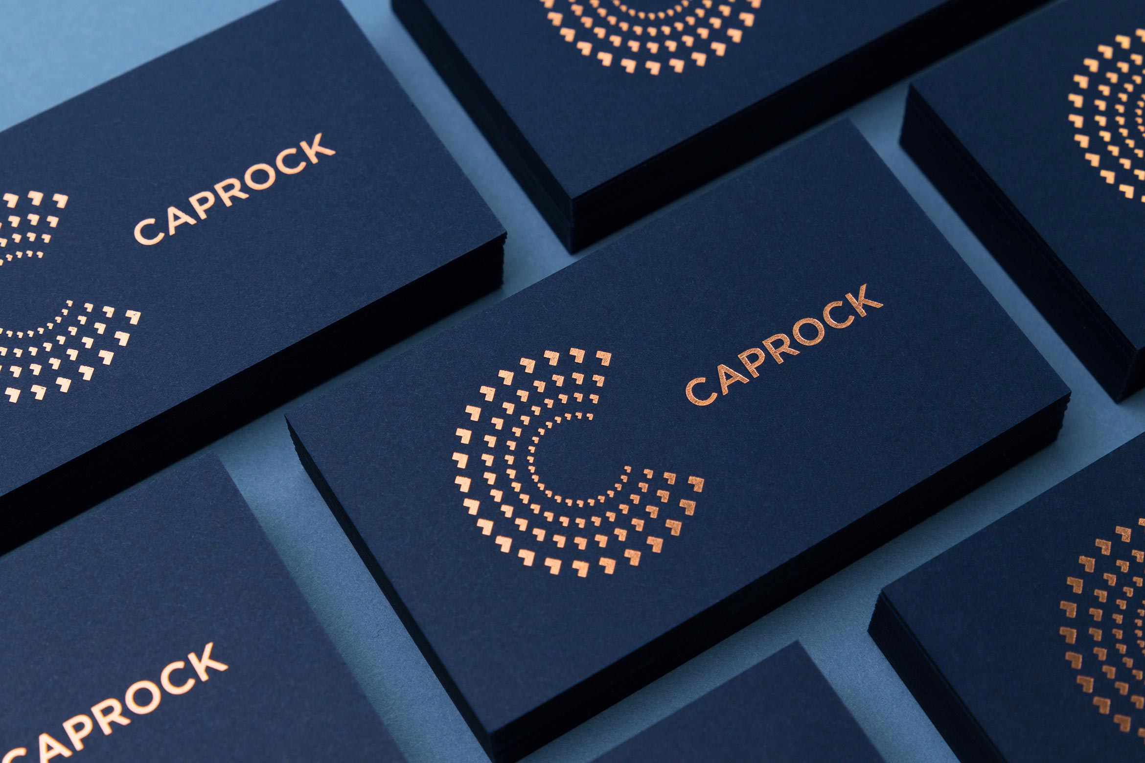
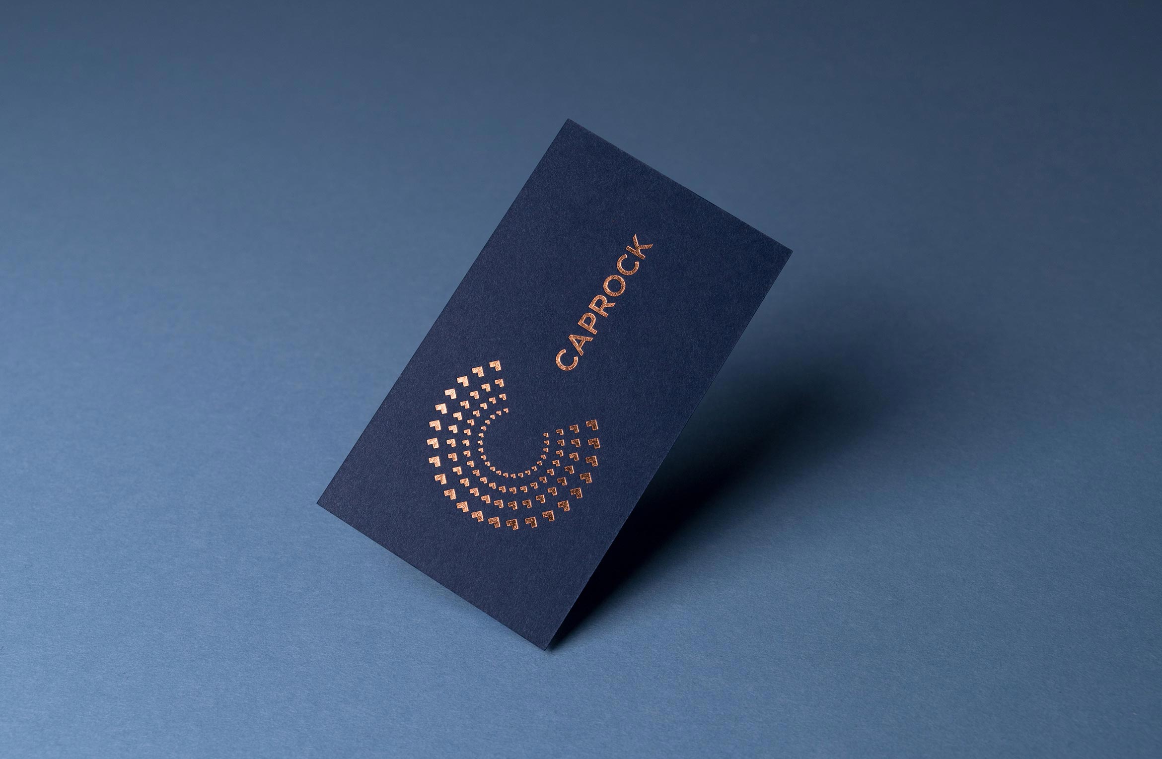
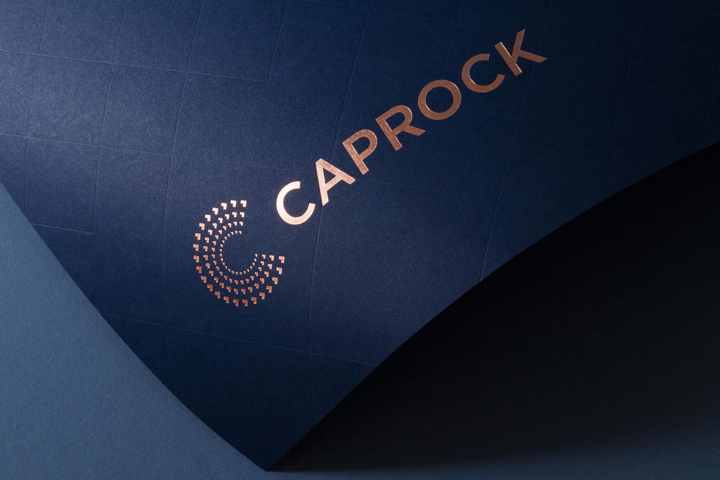
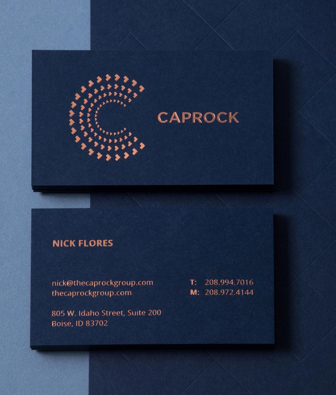
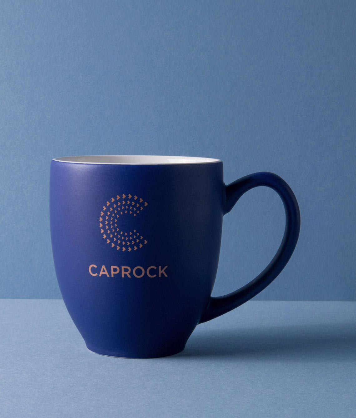
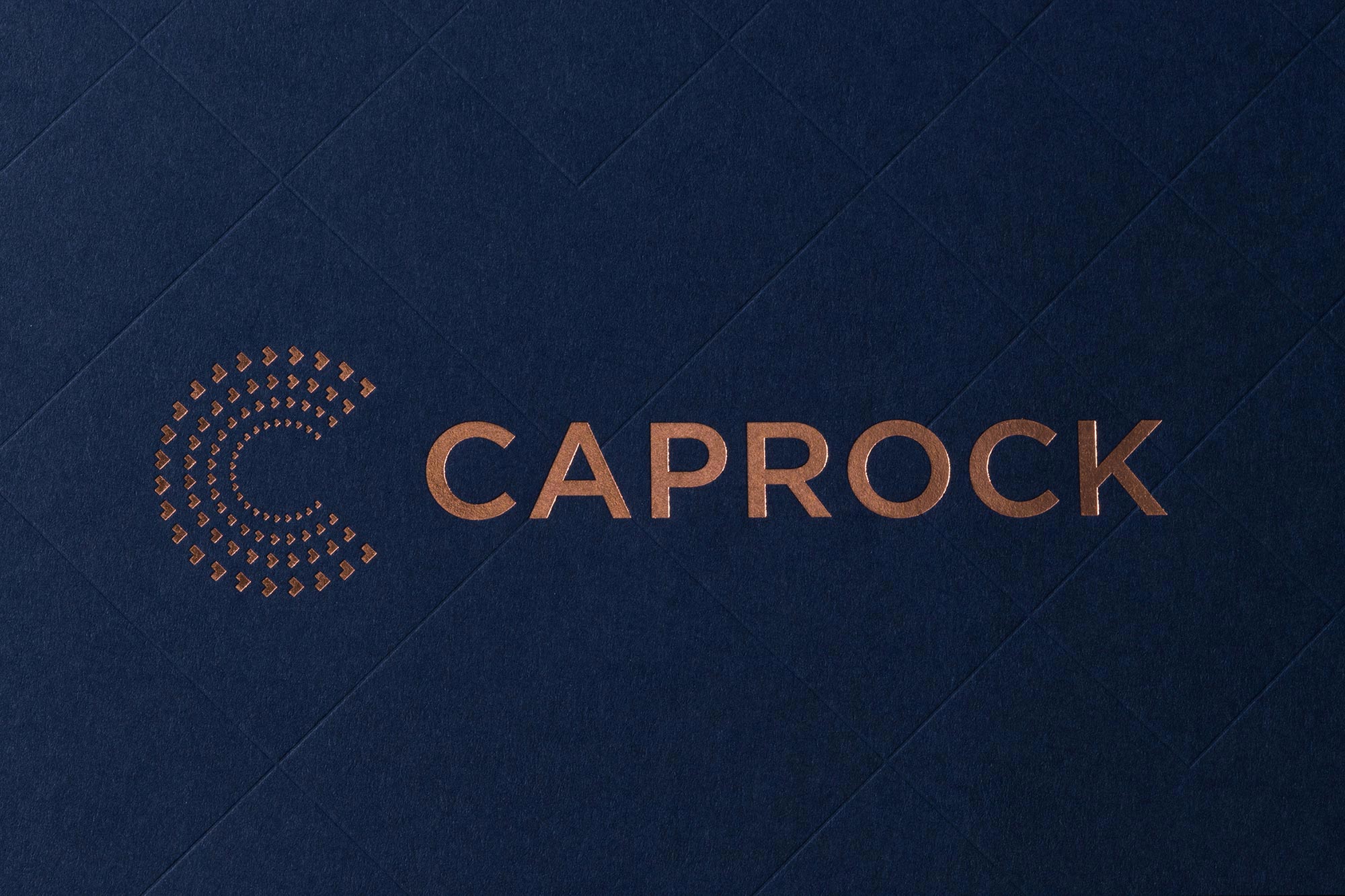
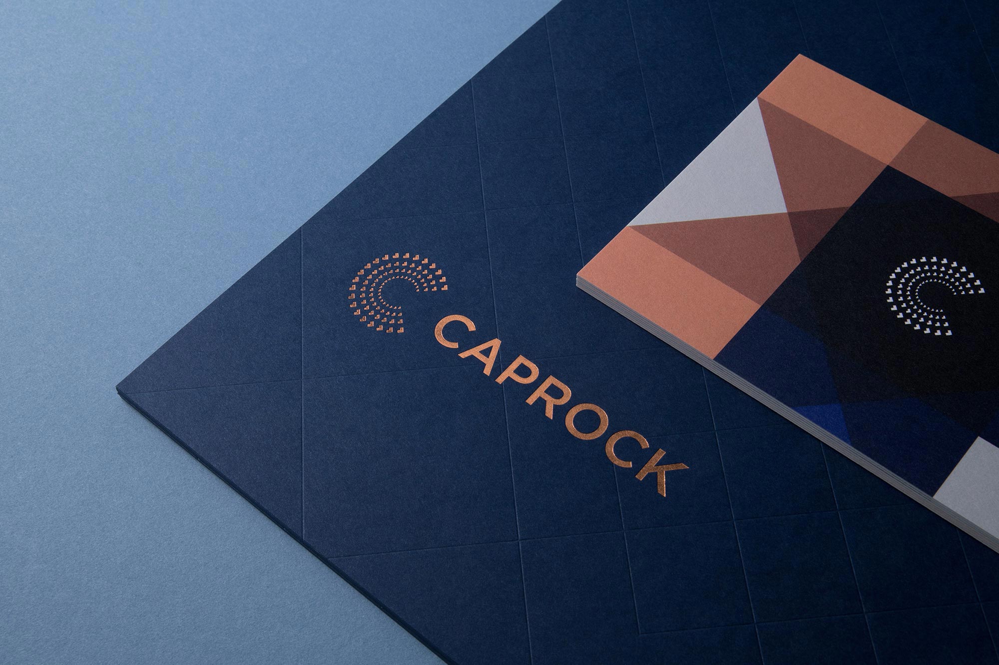
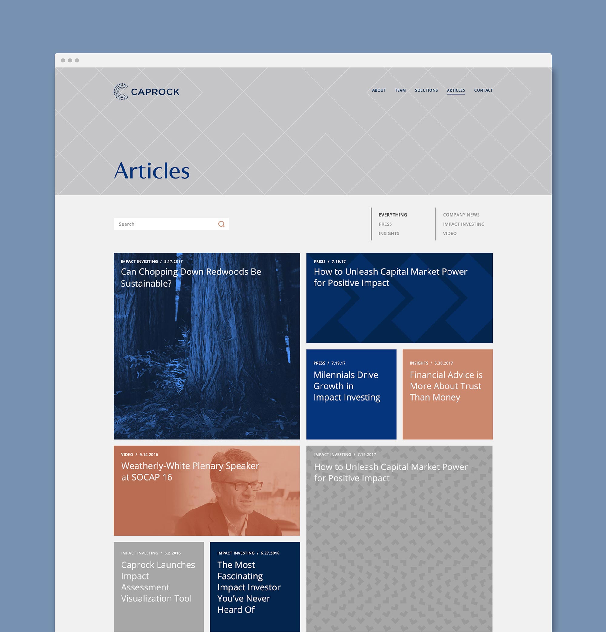
The arrows from the wordmark are used to create a visual system of patterns, motifs and icons that match their energetic work philosophy. We kept their existing Navy and added Copper to the palette, using metallic foil that matches the color of shiny, new pennies.

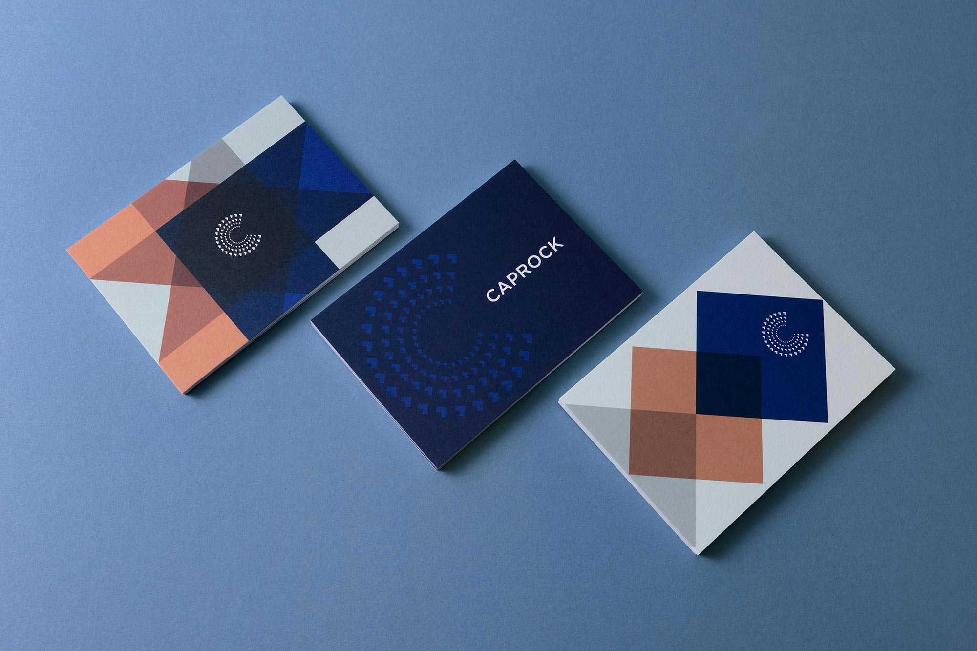
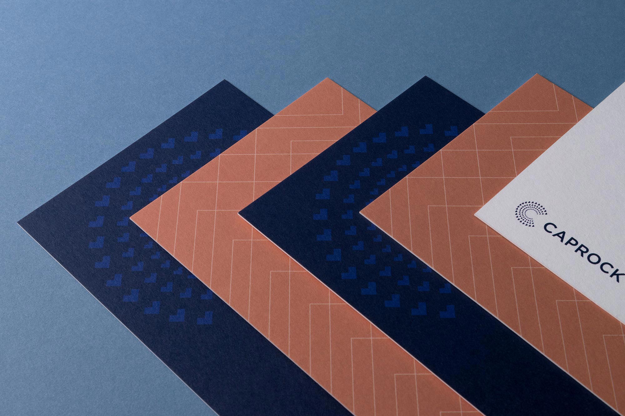
A Brand Styleguide keeps the identity cohesive by outlining rules for the logo, typography, color palette and graphic motifs.
The responsive website tells the story of Caprock using layered parallax graphics, immersive imagery and smart copy that gives a modern take on financial services.